Majority of Maltese students want change of exam font
A MATSEC study shows that Verdana is viewed as the most readable font while Times New Roman, which is the typeset currently used in MATSEC examinations, is viewed as the least readable one

The Maltese matriculation exam board MATSEC has conducted a study to find out which typing font is preferred by students when sitting for exams. According to the report on the study, the choice of font and typeset in exam papers has the greatest impact on students with dyslexia, a condition characterised by trouble with reading despite normal intelligence.
The results of the study show that Verdana is viewed as the most readable font while Times New Roman, which is the typeset currently used in MATSEC examinations, is viewed as the least readable one.
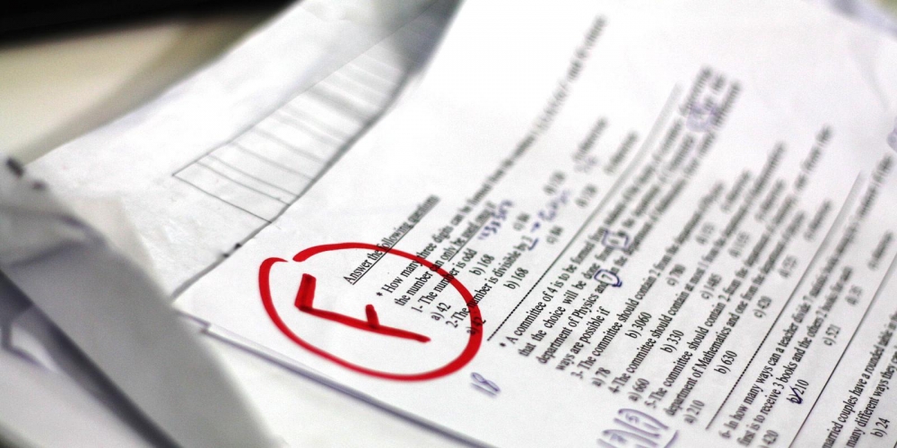
At present, examination papers of the MATSEC Examinations Board are presented in Times New Roman with a font size of 12 pt.
Verdana is preferred by all groups, including those suffering from dyslexia, irrespective of respondents’ age and gender.
Respondents were presented with nine questions each asking them to choose which of three texts, each written with a different font, was easiest to read.
But since the font size for one typeset is not equivalent to the font size of another typeset, the research was repeated by adjusting the font sizes for each font.
This adjustment was made to ensure that the study was not biased in favour of Verdana, Century Gothic, Arial and Comic Sans, which occupy a larger space for the same font size.
Verdana was still viewed as the most readable typeset. However after the font size was adjusted candidates with dyslexia showed a greater preference for Arial rather than Verdana, and so did male candidates. But according to the report, choosing Arial could be problematic as this font fails to distinguish between the letter ‘l’ and capital letter ‘i’.
So far research on the choice of fonts for exams has been rather inconclusive. Moreover, the typeset used is expected to have a greater effect on candidates with dyslexia. The British Dyslexia Association suggests Comic Sans, Century Gothic, Trebuchet, and Calibri while other studies have divergent opinions.
The online survey was sent to 3,000 candidates, 1,300 of whom were candidates who had qualified for access arrangements for dyslexia in the years 2014, 2015 and 2016. The other 1,700 candidates were randomly selected from 2016 candidates for MATSEC examinations. Of these, 458 respondents (15.3%) responded, of whom 101 were candidates with dyslexia. This means that the response rate was much lower among candidates with dyslexia (7.8% as compared to 21%).

.png)
.png)
.png)


.png)


